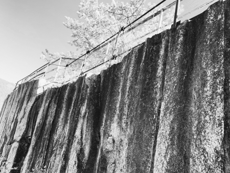
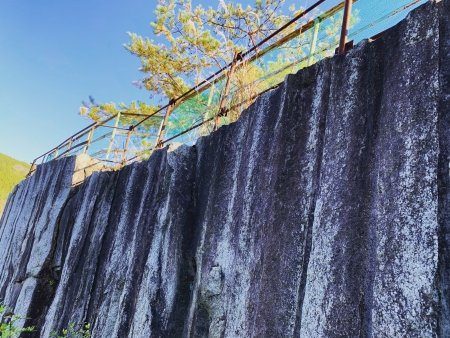
不足と過剰に夢中

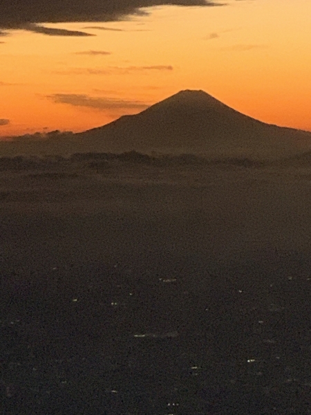
ちょっと何かが足りないこと、ちょっと何かが過ぎることに可能性を感じた。いつもと違う見え方、それは何かが足りない、何が過剰であり、その足りない部分、過剰な部分を頭の中で補い省き処理することでその人だけの像が頭の中にできあがる。完璧の良さは十二分にわかるが、それとは違う良さが過不足にはある。もしかしたら、完璧の良さを上回る可能性すらある。I am crazy about lack and excess.

71E610E1-F947-458F-AE61-4DDD1C958A6B.jpeg

"Insufficient and excessively engrossed"

I felt the possibility that something was missing or something was going too far. It looks different from usual, it is something missing, what is excessive, and by compensating for the missing part and excess part in the head and processing it, an image of that person alone is created in the head. I can fully understand the goodness of perfection, but there is a different goodness in excess and deficiency. Maybe it even exceeds the goodness of perfection.
リンク

中庸=創造

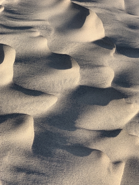
つながることが中庸を生む手段だと砂丘の風紋を見ながら思った。一面の砂な中に凸凹ができることにより周りとは違い場所を生み出す。しかし、その場所は同じ砂の中であるから全くの異質ではない。中庸とは、間を取り上手く調整することではなくて、周りと同じだが違う状態を生み出すことであり、そのためにはまずつながりをつくり、その中で違いをつくること、すなわち、それは創造と同じ結果を生み出すのではないかと考えみた。

E3C9A9B1-D6CD-4B06-A118-AC4591C6377B.jpeg

"Medium = Creation"

Looking at the wind patterns of the dunes, I thought that connecting was the means to create a golden mean. By creating irregularities in the sand on one side, it creates a place different from the surroundings. However, the place is not completely different because it is in the same sand. Moderate is not about adjusting the interval well, but about creating the same but different state as the surroundings, for which you first make a connection and then make a difference in it, that is, it has the same result as creation. I thought that it might produce.

リンク

色は未開拓

対比と同化を使い分けて色を考えることを建築では行わない。現在の建築において色を扱うことは主題ではない。色自体に意味を持たすことが建築の自律性を高めることにはなるが、自律性を高めることが時代にそぐわないし、仮に自律性を高めたとしてもその手段に色を使うことを躊躇する。

それは多分、コルビュジエ やデ・ステイルが100年前に色で自律性を高める表現行為をしており、他の手段、例えばフォルムで自律性を高める手段が技術の発達でより可能になり、その可能性を追求する方が魅力を感じるからだろう。

9775E1EB-CF9D-4C3A-B191-FCC076027191.jpeg

ただ逆に言えば、色が持つ可能性はまだまだ未開拓な部分があり可能性があると言える。

"Color is undeveloped"

In architecture, we do not think about colors by using contrast and assimilation properly. Dealing with color in modern architecture is not the subject. Having meaning in the color itself enhances the autonomy of architecture, but increasing autonomy is not suitable for the times, and even if it enhances autonomy, hesitate to use color as a means of doing so.

Perhaps Le Corbusier and De Stijl were 100 years ago in the act of expressing autonomy with color, and other means, such as the means of increasing autonomy with form, became more possible with the development of technology. Perhaps it is more attractive to pursue sex.

However, to put it the other way around, it can be said that the possibilities of color are still undeveloped.

リンク

消失する輪郭

建築の輪郭について意識してみようと考えた。輪郭がはっきりと主張を持つような自律した建築はいかにも建築らしい建築で好きなのだが、輪郭が周りに馴染み、輪郭があまり感じられないような建築もまた好きであり、それは主張しないということではなくて、周りと馴染むという主張をしていると考えた。

むしろ輪郭が消え去るような状態をつくりたいと考えており、消え去るためのひとつの方法がバックグラウンドまで含めて建築にし、バックグラウンドと輪郭の差異を無くすことである。

15B867EF-1848-4812-9E16-B9189DD10C8B.jpeg

そのためには屋根の形状を利用してバックグラウンドをつくり、消失するような輪郭をつくり出せないかと考えている。

"Disappearing contour"

I thought about the outline of the architecture. I like autonomous architecture that has a clear outline, but I also like architecture that has contours that are familiar to the surroundings and the contours are not so noticeable, which is not to say that I do not claim it. I thought that I was insisting that I would be familiar with the people around me.

Rather, he wants to create a state where the contour disappears, and one way to eliminate it is to build the building including the background and eliminate the difference between the background and the contour.

To that end, he wonders if the shape of the roof could be used to create a background that would disappear.

リンク

はっきりしない輪郭のつくり方

輪郭がはっきりしない様を輪郭の中につくれば良いと思った。はっきりしない輪郭はバックグラウンドとの差異の少なさでつくることができる。

ただ、建築のような大きなものになるとバックグラウンドは風景くらいのスケールになり、なかなかそこまでコントロールできない。

B9FB535A-100C-49B0-ADE0-B24AFA687E48.jpeg

だから、バックグラウンドを建築の一部にしてはっきりしない輪郭をつくろうと考えた。

"How to make an unclear outline"

I thought it would be good to make the outline in the outline so that it is not clear. Unclear contours can be created with little difference from the background.

However, when it comes to big things like architecture, the background becomes a landscape-like scale, and it's hard to control that much.

So I decided to make the background a part of the architecture and create an unclear outline.

リンク

純粋な輪郭ではなくて

輪郭が凸凹したり、ランダムに歪む、反転するなど単なる直線や曲線ではなく不規則に変化する様は、はっきりとしない輪郭を余計に浮かび上がらせる効果があり、それは輪郭がはっきりとすることにつながる。

F9D09797-970A-4581-A267-1192F963B142.jpeg

輪郭を輪郭らしくしないようにいじればいじる程、輪郭が目立つ。むしろ幾何学的な輪郭の方が輪郭が消失するかもしれない。ただ純粋な方向に持っていく方が良いとすると、それは輪郭を単なる直線や曲線にする方が良いとすると、もうそれ以上輪郭について考えることをしないようになるのでそれは避けたい。

"Not a pure contour"

Random changes in contours, such as unevenness, random distortion, and inversion, rather than just straight lines or curves, have the effect of making unclear contours stand out more, which leads to sharper contours.

The more you mess with the contours so that they don't look like contours, the more noticeable the contours will be. Rather, geometric contours may lose their contours. If it's better to just take it in the pure direction, it's better to make the contour just a straight line or a curve, and I don't want to think about it anymore because I don't think about it anymore.

リンク

はっきりしない輪郭

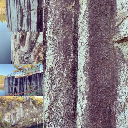
輪郭を動かしてぼかすような効果をつくり出せないかと考えていたら、見ようによっては輪郭がはっきりとしないかもしれないものに出会った。

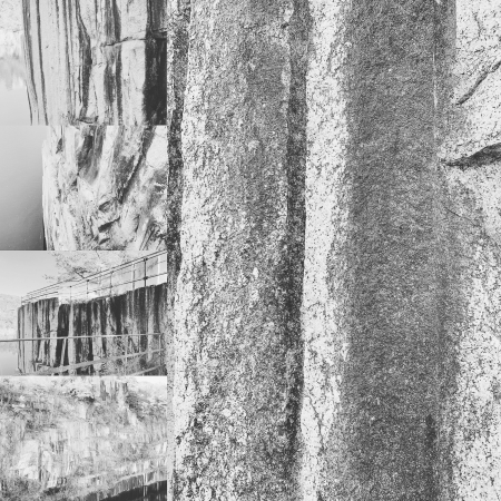
そのもの自体はとても固く、ピン角の輪郭ならばぼけるようなことはない。ただ、輪郭がランダムに歪んでいる、凸凹している。そうすると、はっきりとしない輪郭がはっきりと見える。

596CB7E0-9FDF-4964-BCBC-01CEDF8F76F5.jpeg

はっきりしないこと、ぼかすことはものづくりにおいては同じことだとしてもよいと考えてみた。

"Unclear contour"

When I was wondering if I could move the contours to create a blurry effect, I came across something that might not be clear depending on how I looked at it.

The itself is very hard, and the contour of the pin angle will not be blurred. However, the contour is randomly distorted and uneven. Then you can clearly see the unclear outline.

I thought that uncertainties and blurring could be the same in manufacturing.

リンク