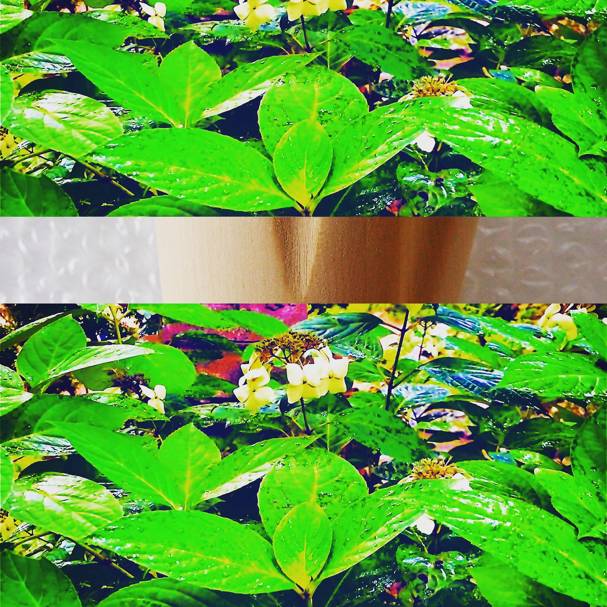
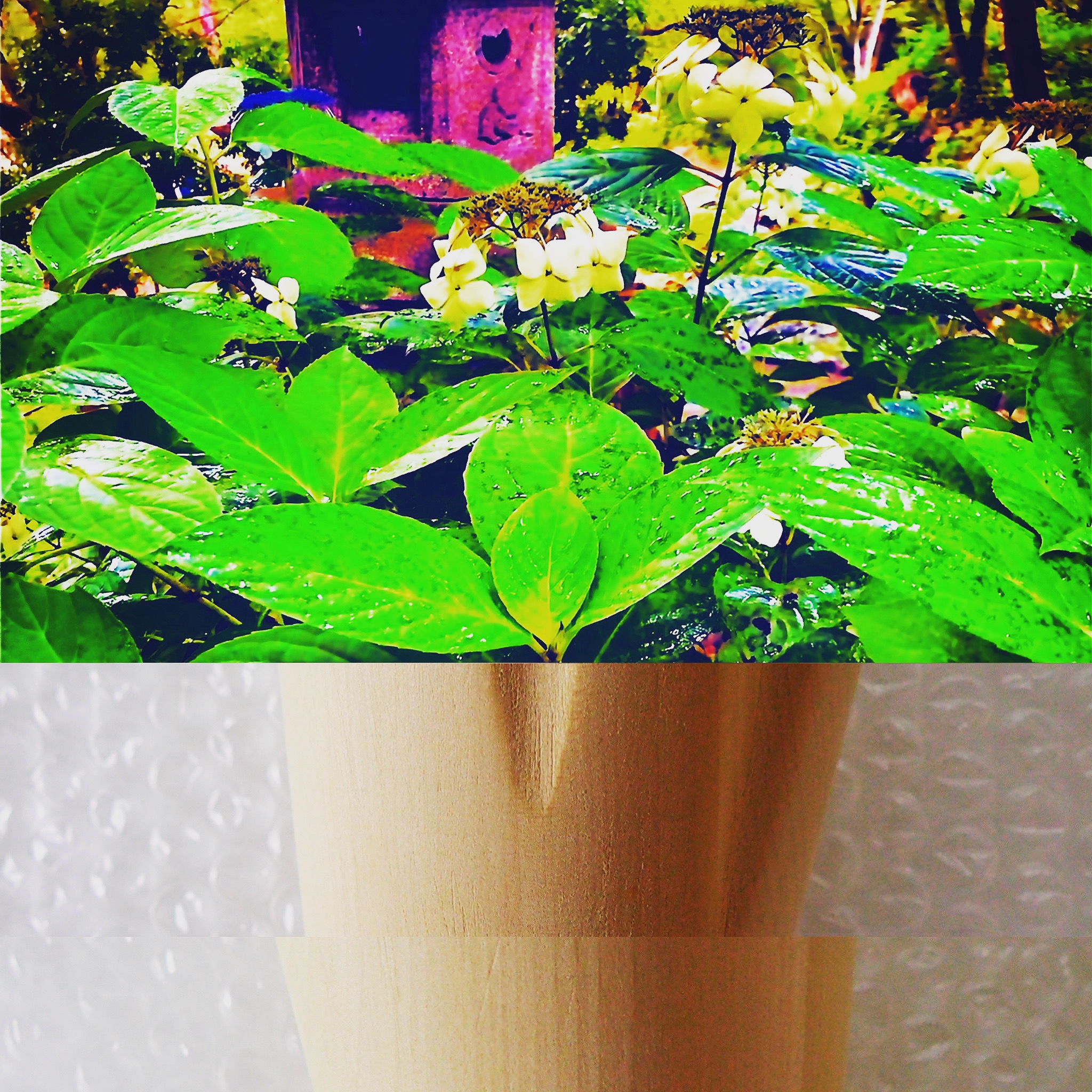
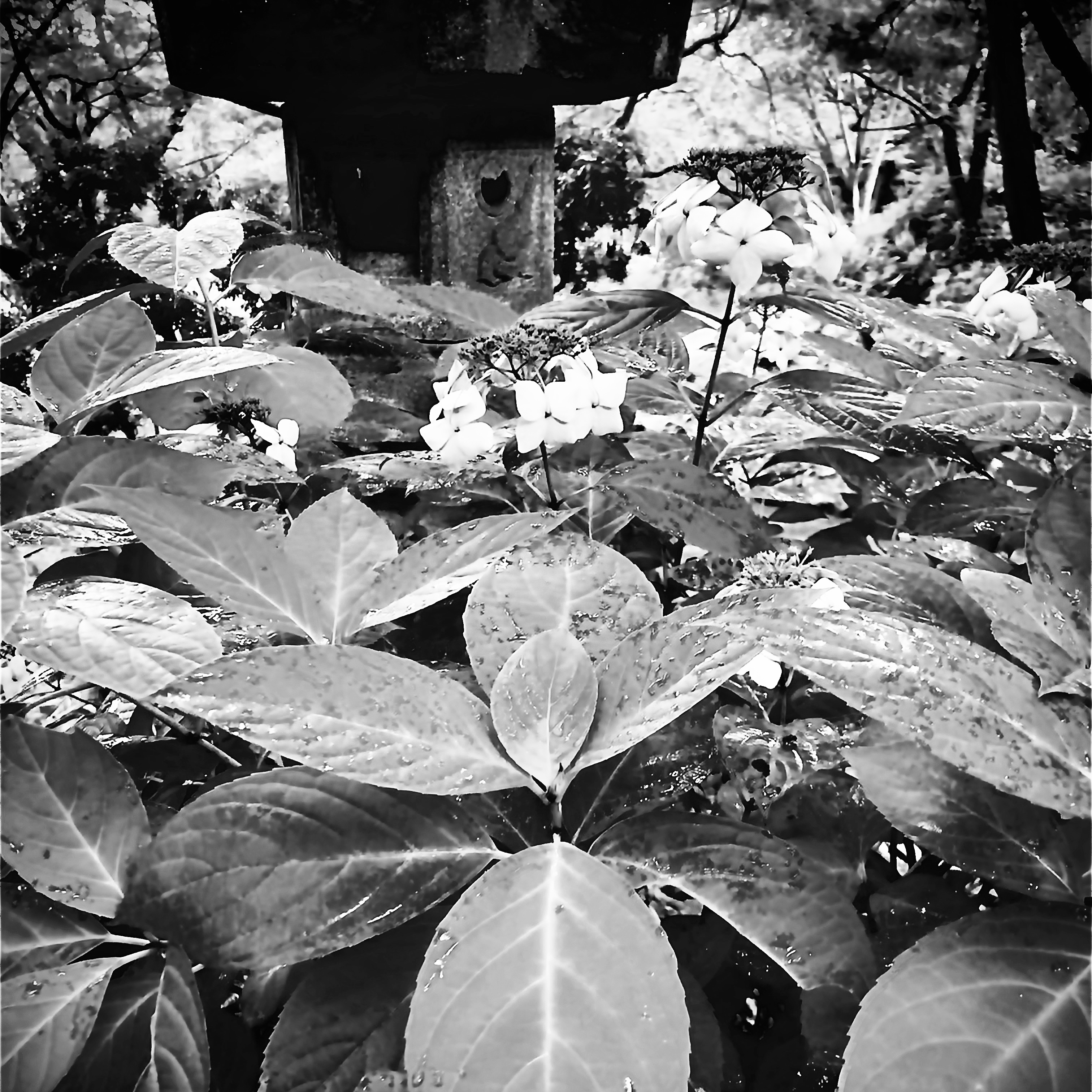
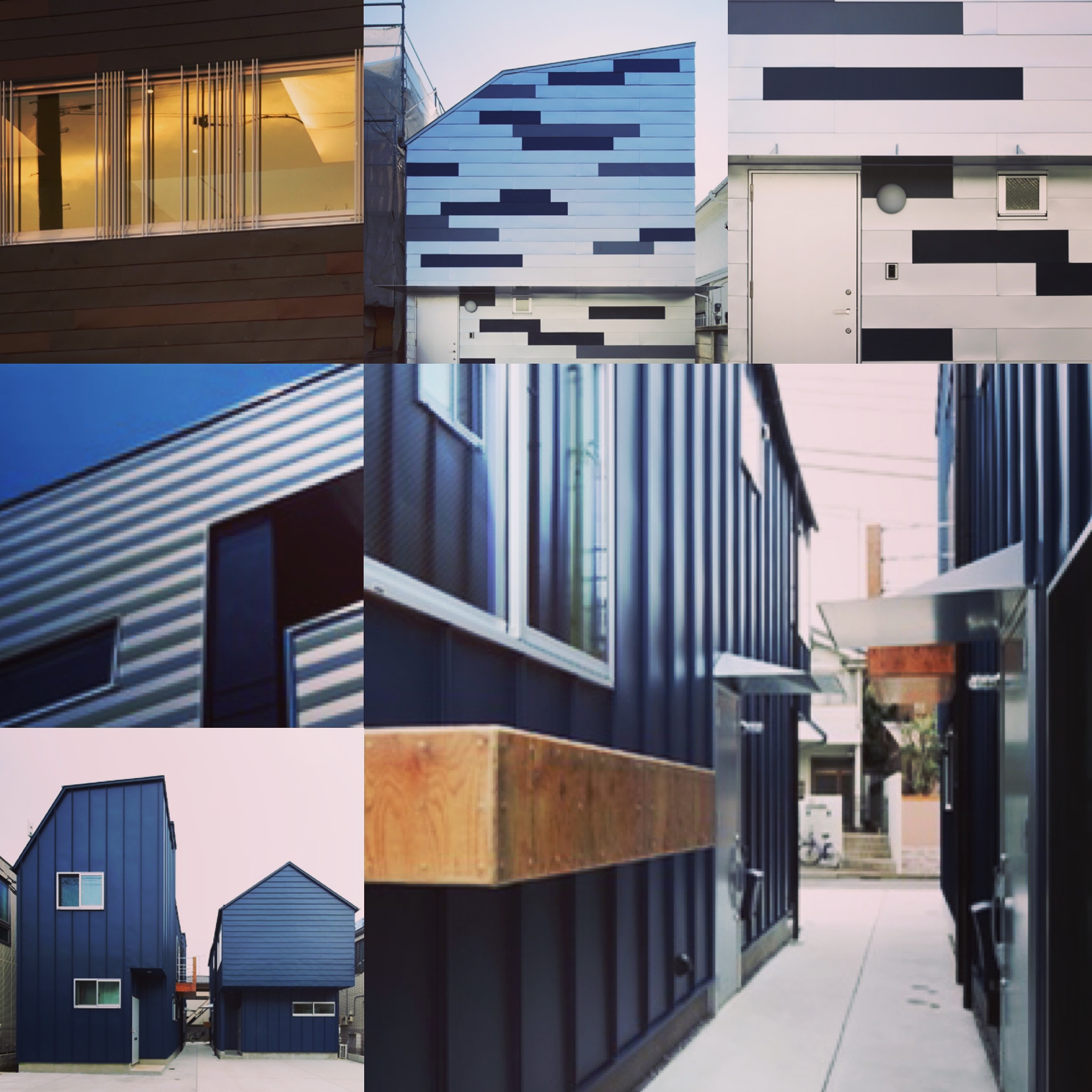
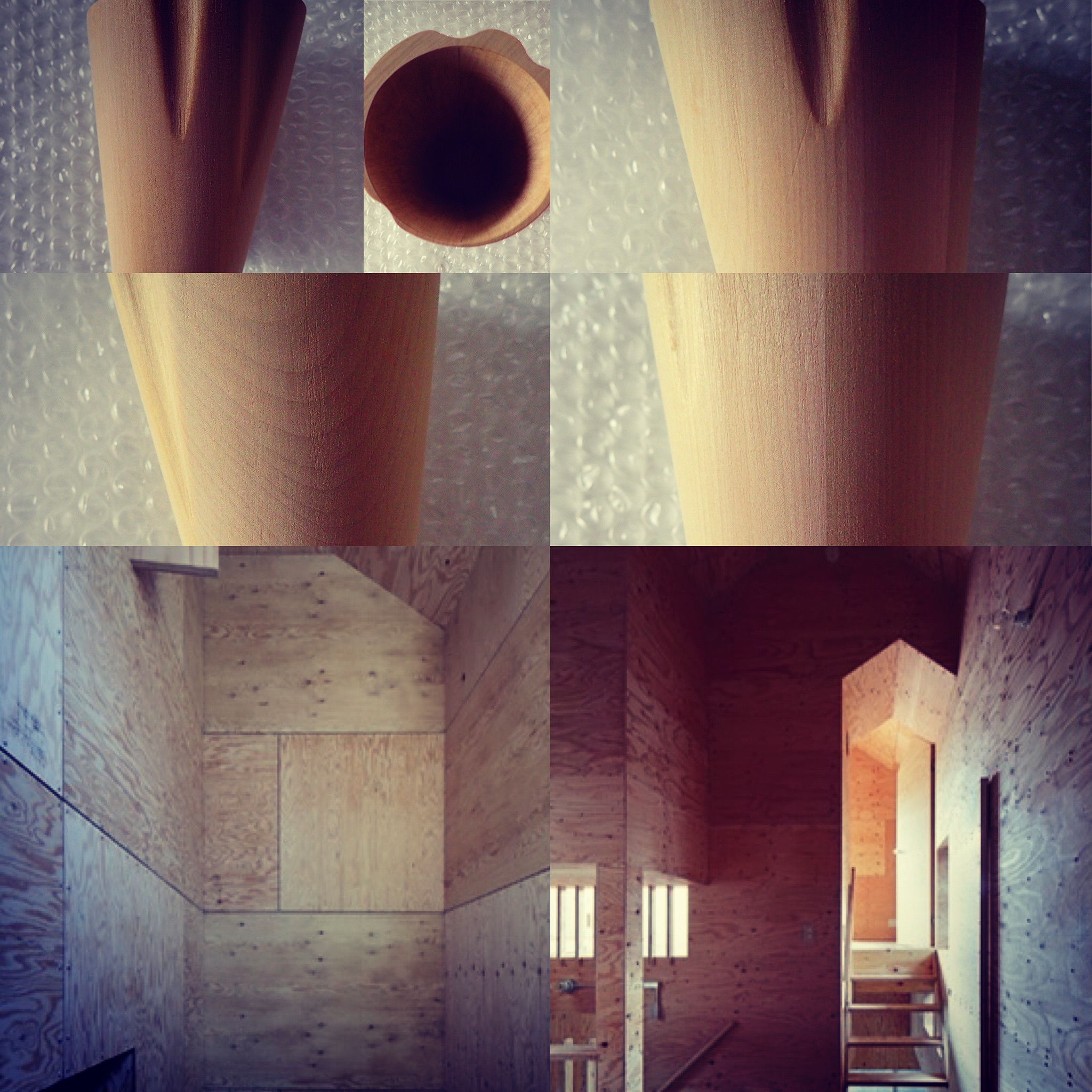
中間の視界

遠くから見てみると、視界の中に入ってくるものの総量が増えるが、どこかに焦点を合わせない限り、たくさんのものが視界の中でただ浮遊しているようにしか見えない。

近くから見てみると、視界の中に入ってくるものは部分になる場合が多いが、全体の把握をせずにはいられない気分になるかもしれない。

全体が部分の総和だけならば、全体がボヤけていても、部分しかハッキリしてなくても問題が無いが、全体と部分が全く違う様相ならば、遠くでも無く、近くでも無い、中間の視界が必要になり、その中間の視界でしか全体も部分も把握できない。そして、その中間の視界は極端では無く中庸なものになるので、見ようによっては一番求めやすい視界かもしれない。

"Intermediate view"

Seen from a distance, the total amount of things that come into view increases, but unless you focus somewhere, many things just appear to be floating in your field of view.

Seen from a close distance, what comes into view is often a part, but you may feel compelled to grasp the whole thing.

If the whole is only the sum of the parts, there is no problem even if the whole is blurred or only the parts are clear, but if the whole and the parts are completely different, the middle view is neither far nor near. Is required, and the whole and part can be grasped only in the middle field of view. And since the field of view in the middle is not extreme but moderate, it may be the most sought-after field of view depending on how you look at it.

リンク

迫る色と広告

色は自律のために存在していると思ってしまう。色に着目する時、色は常にまわりからの影響を受けて相対的に存在をしているのだけれども、その色は時に自己主張をしてくる。その自己主張もまわりからの影響によるが、自己主張の瞬間は自律している。きっとこの感じは広告と同じかもしれない。何気ない日常の中の至る所に広告は存在しており、それが何かの瞬間に浮かび上って訴えかけてくる。広告もまわりとの相対関係の中で効力を発揮させようとするものであるが、時に強い自己主張が刺さるように迫ってくる。

FC6C4D25-A6B7-43FA-A31D-A6F10EA032D3.jpeg

"Approaching colors and advertisements"

I think that color exists for autonomy. When we focus on color, it is always influenced by the surroundings and exists relatively, but that color sometimes asserts itself. The self-assertion is also influenced by the surroundings, but the moment of self-assertion is autonomous. I'm sure this feeling may be the same as advertising. Advertisements are everywhere in casual everyday life, and they emerge and appeal at some moment. Advertising also tries to be effective in the relative relationship with the surroundings, but sometimes it urges a strong self-assertion.

リンク

色が他律へ

その色にしようとすると、すでに色は別の意味を持ちはじめる。物質の表面色は相対的に決まる。今そこにその物質が必然的に存在しているのならば、その物質の表面色は今そこに存在しているための色をしている。すでに色には何かしらの存在の意味が付着している。そこでデザインをする時に色を考える。相対的にデザインを際立たせるために色を決める。その時色には元々付着していた意味にさらに別の意味を重ね合わせることになる。その重ね合わせは物質本来の色とは関係ないところで行われるので、物質本来の色に影響を与えない。物質の表面色を決める時点で表面色だけが独り歩きをはじめる。その独り歩きが今度はまわりを巻き込みはじめる。自律から他律へ変わるのである。

DC86D621-C89F-49FD-A4F9-612721F540F8.jpeg

"Color goes to heteronomy"

When you try to make that color, the color already begins to have a different meaning. The surface color of a substance is relatively determined. If the substance is inevitably present there now, the surface color of the substance is the color that is present there. The meaning of some kind of existence is already attached to the color. So when designing, think about colors. Choose colors to make the design stand out relatively. At that time, another meaning is superimposed on the meaning originally attached to the color. Since the superposition is performed in a place that has nothing to do with the original color of the substance, it does not affect the original color of the substance. At the time of determining the surface color of a substance, only the surface color begins to walk alone. The walking alone now begins to involve the surroundings. It changes from autonomy to heteronomy.

リンク

うつろう色

今見ている世界を今見ている色ではない色で表現することができる。今見ている色は物質の表面色なので物質本来の色とは違う。そう考えると、表面色にあまり意味がなくなってくる。表面色は相対的にたまたまその色になったのではないかと思ったりもしてしまう。

相対的に見て物質が今そこに存在していることを表現する場合、表面色は別に何色でもよくなる。あくまでも相対的なので、例えば、元々の表面色が白だとしても、赤で白の表面色と同じ効果、同じ見え方にすることはできる。

そうすると、色とは、特に物質の表面色とは何だとなる。その表面色にデザインとしての表現を重ね合わせるのに、あまりにもうつろうものではないかと思ったりする。

B2C20B66-DF74-45BD-AF6C-8A80EEA0F731.jpeg

ただ、そう思うのは物質に絶対的な何かを求めているからで、そもそもこの世界を形成している物質が相対的に決まるものだと考えるならば、うつろう表面色が当たり前のことになる。

"Depressed color"

You can express the world you are looking at in a color other than the color you are looking at. The color you are looking at is the surface color of the substance, so it is different from the original color of the substance. With that in mind, the surface color becomes less meaningful. I wonder if the surface color happened to be that color.

When expressing that a substance is present there in relative terms, the surface color can be any number of colors. Since it is relative to the last, for example, even if the original surface color is white, it is possible to obtain the same effect and appearance as the white surface color with red.

Then, what is the color, especially the surface color of the substance? I think it's too difficult to superimpose the expression as a design on the surface color.

However, I think so because I want something absolute from the substance, and if I think that the substance that forms this world is relatively determined in the first place, the depressive surface color is natural. ..

リンク

色だけ

色彩心理学ではないが、色だけでたくさんのことが表現できる。それをしようとしないのは色だけが存在することがないからである。必ずと言ってよいほど、色は何らかの物質の色として存在しているので、色だけに着目せずに、物質に着目し、次に色をどうするか、あるいは、物質と色を同時に考える、というように色だけではない。

色は光の反射があってはじめて判別できるので、実際は色だけでは存在できず、また光の反射が四方に拡散すれば空間を染めることもある。

B39824C1-035B-4EE6-9875-3A63F1CC3313.jpeg

だから、色だけを取り出して認識するようなことをそもそも普通の人はしない。色は見た目の色以外の色として認識できることを普通の人は知らない。

"Only color"

It's not color psychology, but you can express a lot with colors alone. I don't try to do that because only color can't exist. It is almost always the case that color exists as the color of some substance, so instead of focusing only on the color, focus on the substance and then what to do with the color, or think about the substance and the color at the same time. It's not just about color.

Since colors can only be identified by the reflection of light, they cannot actually exist by themselves, and if the reflection of light diffuses in all directions, the space may be dyed.

Therefore, ordinary people do not take out and recognize only colors in the first place. The average person does not know that a color can be recognized as a color other than the apparent color.

リンク

色単体の表現

色は不思議な存在で、色によって物質感まで表すこともできるけれど、色自体が物質だから、上手く使えば色単体で成立してしまう。

木目の物質感を表すのに茶色を使えばいいし、金属の物質感を表したければシルバーを使えばいい。近寄れば、本物との違いは一目瞭然だが、少し離れてしまえばわからないかもしれない。それはとても雑な表現として色を使う場合だが、その雑さが丁度いい場合もある。

既視感のある物質感は色のみで再現できる。それは見る方が勝手に想像力を働かせるからである。ただ、それでは本物との違いで見劣りする。

色単体でしか表現できない物質感があると思っている。その色の物質感には既視感がないはずである。なぜなら、既視感は物質に抱くのでは無く、過去の体験や記憶に抱くから、色はあまりにも日常的にある存在過ぎて体験や記憶の網目に引っ掛かってこない。

05992A4F-3E28-4E78-A374-287859DC03A5.jpeg

だから、色単体で成立させようとする場合は、相対的に成り立たせるように、既視感を抱く物質と組み合わせて配置すれば容易に表現できる。

"Expression of a single color"

Color is a mysterious existence, and it is possible to express a sense of substance by color, but since color itself is a substance, if used properly, it will be established by itself.

You can use brown to express the texture of wood, and silver to express the texture of metal. The difference from the real thing is obvious when you get closer, but you may not know it when you get a little further away. That's when you use color as a very crude expression, but sometimes it's just right.

The material feeling with déjà vu can be reproduced only by color. The reason is that the person who sees it uses his imagination without permission. However, it is inferior to the real thing.

I think there is a sense of substance that can only be expressed by color alone. There should be no déjà vu in the materiality of that color. Because déjà vu is not embraced by matter, but by past experiences and memories, colors are too everyday to be caught in the mesh of experiences and memories.

Therefore, when trying to establish a color by itself, it can be easily expressed by arranging it in combination with a substance having a déjà vu so that it can be established relatively.

リンク

空隙に漂う

物質の空隙に人が漂う状況を建築だとするならば、物質の空隙のつくり出し方が今までの建築とは違ってくるかもしれない。

木造や鉄骨造などは線状部材の組み合わせで建築を築き上げるので、出来上がった建築は物質の空隙とは呼べるようなものではない。鉄筋コンクリート造は物質の空隙風に構築できるが、木造や鉄骨造などと同様に線状部材で建築を築き上げていく場合もあり、なかなか空隙に漂う感じとはいかない。

087AC99C-C7E6-45E3-9A65-B8FE7B094C04.jpeg

イメージに近いのは洞窟かなと思った。塊の中から空隙をくり抜くイメージになる。そうなるとそもそも建築のつくり方ではない。

"Floating in the void"

If the situation where people float in the voids of matter is architecture, the way of creating voids of matter may be different from the conventional architecture.

Since wooden structures and steel structures are constructed by combining linear members, the completed architecture cannot be called a void of material. Reinforced concrete construction can be constructed in the style of material voids, but as with wooden structures and steel structures, there are cases where the building is built with linear members, so it does not feel like floating in the voids.

I thought it was a cave that was close to the image. The image is that the void is hollowed out from the mass. In that case, it is not a way to make architecture in the first place.

リンク