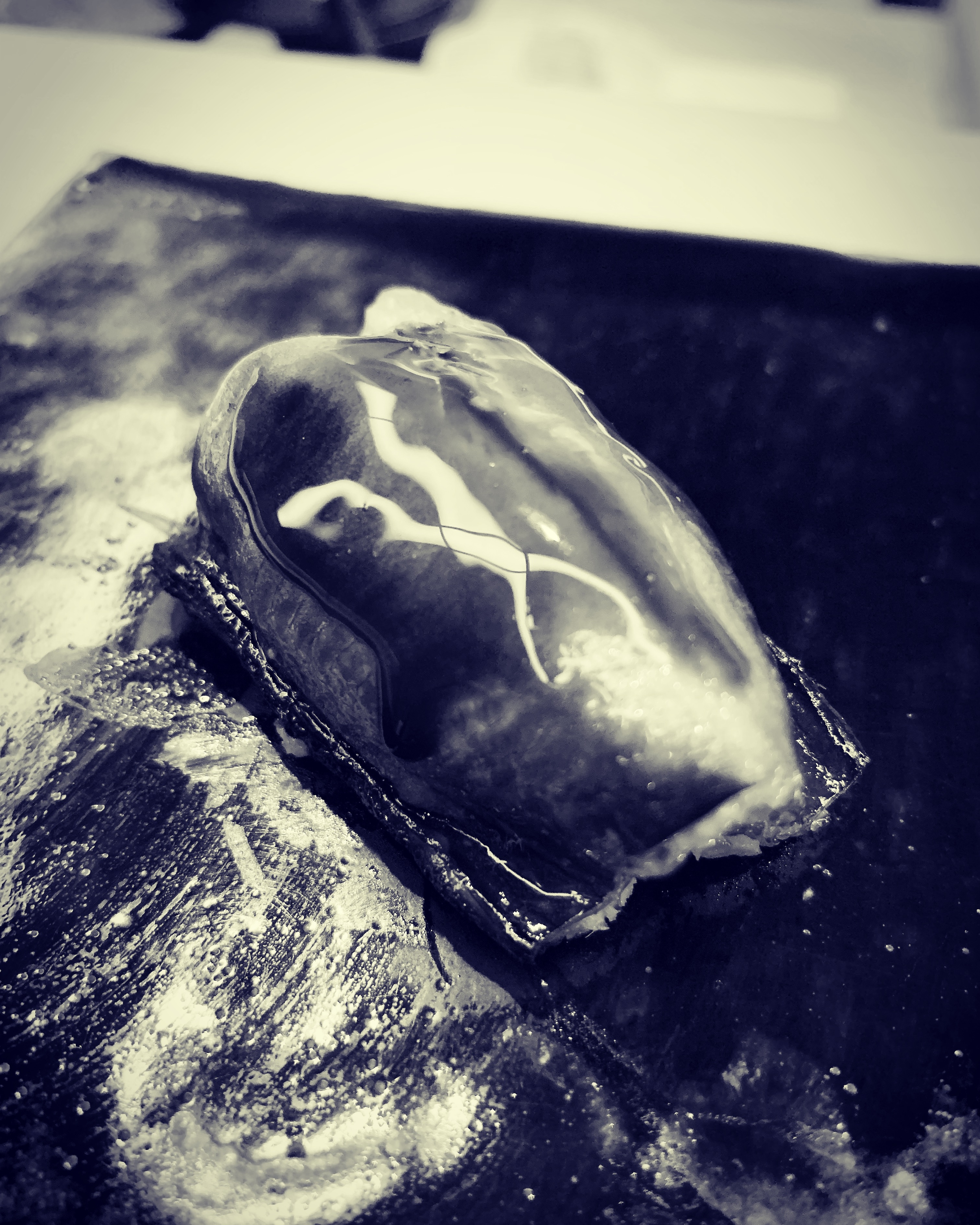
まず見てしまう

常に全身で体感するし、してしまう、建築は人のスケールよりも大きく、建築は空間を内包する、そもそも、その空間をつくるために建築行為は存在するから、体感が前提になる。

しかし、人は体感することよりも、視覚が先行する。視覚も五感の一部だから、視覚も体感の一部と考えるかもしれないが、モダニズム建築以降、視覚だけが分離した。

20世紀初頭、写真の発達により、その写真に建築をどのように載せるか、写真に載せることができる建築の部分は一部だけ、全てを載せることはできない、その建築の一部が写真として広まる。

体感すること無しに、その建築の一部の写真を見て、その建築の全てを把握できるようにしなければならない、それも写真はその場にとどまることはない、建築はその場所から動くことはできないが、写真となった建築は自由に動き回ることができるから、時間的余裕がない、だから、瞬時に全てを把握できるようにしなくてはならない。

視覚優位に建築が展開されていく、瞬時の視覚を経て、体感へと移行する建築が優位になる。

もちろん、モダニズム建築は変遷していくのだが、そもそも現代の建築や都市はモダニズム建築を下敷きにしているので、視覚が優位になりやすい。それが人の感覚器官にまで影響を与えていると言っても過言ではないだろう、人は日々、建築や都市に内包されているのだから、影響を受けないはずがない、インスタ映えを欲しがるのもうなずける。

体感が前提で建築行為は存在する、しかし、体感の前に視覚がくる、この認知のズレというか、感じる前に見てしまうことが起こるということが、建築デザインをする上で肝になることで、どう見せるか、どう見えるか、建築雑誌をパラパラと見ていて、そもそもここでも見るから入るのだが、止まるのは既視感がない建築になる、すでに見慣れ光景には興味がわかない、「既視感がない」ということにその建築の全てが凝縮されている。

BA957CB6-5713-46DE-BA23-7FA6B72AFF8D.jpeg

"I see first"

You always experience the whole body and you feel, building is bigger than human scale, and building includes space. Because building act exists to create the space from the beginning, the sense of living is a premise.

However, the vision precedes the human being to feel. Since vision is also part of the five senses, vision may be considered part of bodily sensation, but since modernism architecture, only vision has separated.

At the beginning of the twentieth century, with the development of photography, how to put architecture in the photograph, only a part of the architecture that can be put in the photograph, but not all, part of the architecture spreads as a photograph .

You must be able to look at some of the photos of the architecture and make it possible to grasp all of the architecture without experiencing it, and the photos will not stay there, the architecture will move from that location Although it can not be done, since the architecture which became a photograph can move freely, it can not afford time, so it must be able to grasp all in an instant.

As architecture is developed in a visual superiority, through instantaneous vision, an architecture that shifts to a bodily sensation becomes superior.

Of course, modernist architecture is changing, but since modern architecture and cities are based on modernist architecture, vision tends to be dominant. It is no exaggeration to say that it affects even human sense organs, because people are included daily in architecture and in the city, they can not be influenced, wanting insta light I can't make it worse.

Building act is premised on bodily sensation, but there is a gap in this cognition when vision comes before bodily sensation, or that it happens to be seen before feeling it, and it becomes a key point in doing architectural design So, I wonder how to see it and how to see it, because I look at architectural magazines as flip-flops, and I'm going to see it from the first place, but the stop will be an architecture with no sense of sight, I'm not interested in sights already familiar, All the buildings are condensed in the sense that there is no sense of sight.

真っ暗なスクリーン

真の想像力を働かせるためには、目を閉じるしかない。目の前で起こることを見てしまったら、その範囲でしか頭が働かないから。

目で見ることで情報源の8割を把握する、すなわち、視覚で8割が決まる、仮に、視覚以外の感覚、聴覚、味覚、嗅覚、触覚を全て遮断したとしても、裁量の部分は2割しかなく、8割決まれば、大概はその印象になる。

だから、目を閉じることで、8割の情報を遮断し、聴覚、味覚、嗅覚、触覚を使い2割の情報を取得し、8割を裁量の部分に回せば良いとなる、単純な計算ならば。

目を閉じればわかるが、見ることを遮断しても、人は目で見ようとしてしまう。ただ単に、シャッターが閉まっているが如く、瞼が閉じているだけで、シャッターの中では、目の中では視神経が働いている。

すなわち、目を閉じても、五感の割合は変わらず、視覚が0になる訳ではなく、視覚以外の感覚が2割以上になることもない。

8割の視覚情報が真っ暗、真っ暗なスクリーンがそこにあるだけ、ただ、その状態になってはじめて、その真っ暗なスクリーンに、それまで経験した過去の出来事が素となって発揮される想像力が映像を映し出してくれる。

だから、いずれにせよ、人は視覚に左右されており、それはあまりにも今まで目で見てきた映像や画像の蓄積が脳にたくさんある証拠というか、すでに人が視覚優位から逃れられない証拠になる。

A1490EE8-418C-44CF-91EE-5994655EB956.jpeg

"The dark screen"

The only way to make your true imagination work is to close your eyes. If you see what happens in front of you, your head only works in that range.

80% of the information source can be grasped by visual observation, that is, 80% can be determined visually, even if all senses other than visual sense, hearing, taste, smell and touch are cut off, the discretionary part is 20% There is only one, and if it is 8 percent, it will usually be the impression.

So, by closing your eyes, you can block 80% of information, use hearing, taste, smell and touch to acquire 20% of information, and turn 80% into the discretionary part. If

I know if I close my eyes, but even if I stop seeing, people try to look at my eyes. Just like the shutter is closed, the eyelids are just closed, and in the shutter, the optic nerve is working in the eyes.

That is, even if the eyes are closed, the ratio of the five senses does not change, and the sense of sight does not become zero, and the sense other than the sense of sight does not become more than twenty percent.

As long as 80% of the visual information is completely dark and there is a very dark screen, it is only when it is in that state that the imagination of the past events experienced so far is displayed on the very dark screen. Will be projected.

So, in any case, people are affected by vision, which is evidence that there is a lot of accumulation of images and images that have been seen so far in the brain, or evidence that people can not escape from visual superiority already. Become.

暗黙のルール

写真だとスケール感がわからない時がある。

先日、手に入れたアンジェロ・マンジャロッティがデザインした置時計「セクティコン」がそうだった。実物を今まで見たことがなく、写真でしか知らなかった。写真でどのような形をしていて、色や細部のデザインは知っていたが、大きさを数値で把握していた訳ではなく、大きさは写真から勝手にこのぐらいだろうと想像して決めつけて、特にそのことに気も止めてもいなかった。

セクティコンの実物をはじめて見て持った時の印象は「意外と大きくて重いな」で、それがデザインの印象より先だった。

重さは数値で知ったとしても、あまり実感がわかないかもしれない。普段から物の重さを扱っているならば、数値で言われても感覚的に重さがわかるだろうが、大きさならば感覚的にわかるが、今回はなぜかはじめから勝手に決めつけていた。

よく考えてみれば、セクティコンは船室用置時計としてデザインされたものだから、船の揺れに耐えるためにも、ある程度の重さが必要だろうし、視認性を考えれば、文字盤の大きさはこのくらいは必要だから、全体の形状をこのデザインにするならば、大きさは当然このようになる。そこで、もしかしたら、外装にプラスティックを使い、見た目で少しでも軽快さを出そうとしたのかもしれない。

ただ、なぜか、写真で見たセクティコンの形状ではもっと小さいものになる、というか、もっと小さいものを求めてしまう。自分がもしセクティコンと同じ形状のものをつくろうとしたら、もっと小さくするだろう。それは好みかもしれないし、もしかしたら、実際に小さくつくったら、やはりこの大きさの方が良いとなるかもしれない。

重さは素材を変えれば自由にコントロールできるが、後は視認性の問題、そこから大きさが決まるだろうが、ただやはり、この形状のデザインに対して大きさが合っていないように思う、それをスケール感と呼ぶならば、スケール感が合っていないように思う。

セクティコンを見ていて、デザインとスケール感には相関関係がある、言い換えれば、暗黙のルールがある、と改めて思った。

35C8F4C1-0335-4C03-B803-7CD095306B24.jpeg

"Implicit rules"

There are times when I do not understand the sense of scale with photos.

The table clock "Secticon" designed by Angelo Manjarotti, which I got the other day, was so. I have never seen the real thing, I only knew in the picture. I was in the shape of the picture, I knew the design of the color and details, but I did not know the size numerically, I decided that I imagined that the size is about this from the photo I was not particularly worried about it.

The impression when I first saw and held the real of the secticon was "It's unexpectedly large and heavy", which was ahead of the impression of design.

Even if you know the weight numerically, you may not realize much. If you usually deal with the weight of things, weight will be understood sensibly even if it is said numerically, but if it is size, it will be felt sensibly The

If you think about it carefully, because secticon is designed as a table clock for the cabin, it will need a certain amount of weight to withstand the ship's shaking, and considering the visibility, the size of the dial is this much Is necessary, so if you make the whole shape this design, the size will naturally be like this. So maybe I used plastic for the exterior and tried to put out some lightness in appearance.

However, for some reason, the shape of the secticon seen in the photograph will be smaller, or something smaller will be sought. If you try to make it the same shape as the secticon, you will make it smaller. It may be a preference, and if it actually gets smaller, it may still be better for this size.

The weight can be controlled freely by changing the material, but after that the problem of visibility, the size will be decided from that, but still it seems that the size does not match the design of this shape, If you call it a sense of scale, it does not seem like a sense of scale.

Looking at the secticon, I thought again that there is a correlation between design and sense of scale, in other words, there is an implicit rule.

スケール感の無力化

どんどん大きくなったり、どんどん小さくなったりできるとすると、スケールなんてあってないようなものになる。

大きさが変わらないから、スケール感が大事になるのであって、こちらが自由に大きさを変えることができれば、多少スケール感がズレていようが大した問題ではない。

あとひと回り小さければ良いのにとか、大き過ぎなんだよなとか、はどうでも良いことになる。

スケール感だけが唯一のデザイン要素だとしても、そのスケール感を適切というか、合ったものにするだけで良く見えるし、その反対に、形は綺麗なのだが、スケール感が、あとちょっとだけ大きい方がいいとか、スケール感が合わないと、スケール感だけの話でせっかくの綺麗な形が台無しになることもある。

そのくらいスケール感は重要で、ただ、具体的に何センチがいいとか、何ミリがいいとかは無いので、感覚的なものを養う必要がある。

そのスケール感が無力化するとしたら、スケール感に変わるデザイン要素は何になるだろうか、また、それでも残るスケール感はあるはずで、その時に何を頼りにスケール感を決めれば良いのか、ただ感覚だけの話では無いような気もするが。

仮定の話で、スケール感が無力化する状況で考えてみると、全体の大きさが決まらない。それこそ何を頼りに決めれば良いのか、わからなくなってしまう。そして、全体の大きさが決まらないと何も進まない。

部分をつくることはできるが、その大きさも全体の大きさに依存するから、やはり、何もできなくなる。

きっと世の中に大きさを自由に変えることができる生物がいないのは、このような理由からだったりして。

1A45EFE4-95F6-4D0F-AA04-1A375FE23789.jpeg

"Inactivation of the sense of scale"

If you can get bigger and smaller and get smaller, it will be like you don't have a scale.

Since the size does not change, the sense of scale is important, and if this can freely change the size, it is not a big problem that the sense of scale may be somewhat off.

It would be fine if it would be better if it was a little smaller, or if it was too big.

Even if only the sense of scale is the only design element, it looks good if the sense of scale is appropriate or appropriate. On the contrary, the shape is beautiful but the sense of scale is slightly larger If you don't like it, or if it doesn't match the scale, the story of the scale may ruin the beautiful shape.

The sense of scale is so important, however, it is necessary to cultivate sensory ones, because there is no specific thing about how many centimeters are good or how many millimeters are good.

If the sense of scale becomes ineffective, what will be the design elements that will change to a sense of scale, and there should still be a sense of scale that remains, and what should be used to determine the scale sense at that time, just the sense I do not feel like it's a story.

If you think about the situation where the sense of scale is incapacitated in the story of assumption, the size of the whole can not be decided. You will not know what to do with it. And nothing happens if the size of the whole is not decided.

You can create parts, but the size also depends on the size of the whole, so nothing can be done.

It is probably because of this reason that there is no living thing in the world that can freely change its size.

ものづくりの真髄

毎朝コーヒーを飲む時に、今日はどれにしようかな、とカップを選ぶのが楽しみのひとつ、最近、ずっと気に入って使っているカップが因州中井窯のもの。

因州中井窯は、鳥取にあり、民藝を代表する窯元で、柳宗理ディレクションの器もつくっている。特徴は染め分けで、緑と黒、緑と白に半々に染め分けする器が代表的なもの。

うちには同じ種類のカップが2つあり、最近、ずっと気に入って使っているカップはそのうちの1つ、いつも同じ、パッと見はほとんど違いはないが、僅かに違う。

胴の部分の曲線が違い、その差は1mm以内だが口径が僅かに違い、縁の厚みも微妙に違う。

焼き物ならばよくある話で、個体差、同じ種類のカップでもつくり手が違えば、微妙に形は違うし、焼き物は焼く時に窯の中で収縮をするので、窯の中での位置の違いにより温度も違うので、収縮率も違う。

だだ、2つを比べてみて、はじめて分かるくらいの微妙な違いなのだが、同じ種類のカップなのだが、いつも使うのはそのうちの1つ、いつも同じ。

見た目にはほとんど違いはないから2つとも気に入っているが、コーヒーを飲んで使うところまで含めると、その飲んで使う感覚まで含めると、明らかにそのうちの1つの方が良い。

その微妙な形の違いが、実際に使う時には増幅されて、大きな違いとなって使う側の感覚に訴えてくる。

もちろん、それが良いか悪いかは好みの問題だから、良し悪しはどうでもよいのだけれども、微妙な形の違いが使う時に増幅されるのが面白く、それは使わなければ分からないことで、こういう微細な形の違いが有る無しは、1つ1つ手でつくるから起こることで、それが人の感覚に影響を与えることが素晴らしく、それが正しくものづくりの真髄だと感心した。

BA7DC41E-3E22-47FF-B358-BF896382E38A.jpeg

"The essence of manufacturing"

One of the pleasures of choosing a cup when drinking coffee every morning is one of my favorite cups.

Inshu Nakai is located in Tottori, and is a representative of folk songs, and is also making pots for the direction of the Sori Yanagi. Distinctive features are dyed, green and black, green and white dyed in half and half.

There are two cups of the same kind in my house, and recently I have always liked and used one of them, which is always the same.

The curve of the body part is different, and the difference is less than 1 mm, but the aperture is slightly different, and the thickness of the edge is also slightly different.

It is a common story about grilled dishes. Individual differences, even if the same kind of cups are made differently, the shape is slightly different, and the grilled foods shrink in the cocoon during baking, so the difference in the position in the cocoon Because the temperature is different depending on the shrinkage rate is also different.

Well, it's a subtle difference that you can see for the first time by comparing the two, but it's the same kind of cup, but always using one of them, always the same.

There is almost no difference in appearance, but I like both of them, but if you include coffee and use it, obviously one of them is better if you include the feeling of using it.

The difference in the subtle form is amplified when actually used, and it makes a big difference and appeals to the sense of the user.

Of course, whether it is good or bad is a matter of taste, so it doesn't matter whether it is good or bad, but it is interesting that the difference in subtle form is amplified when it is used, and that it is impossible to know it There was a difference in the form because it was created by hand one by one, and it was wonderful that it affects human senses, and I admired that it is the essence of making things right.

セクティコン

見る者と見られる者がいるという関係性が成り立つのが普通のことだと仮定したら、それが、見る者と見られる物でも良いのだが、その関係性自体が近代以降のことかもしれないが、外形には何かしらの意味を持たせることになるだろう。

外形とは、人ならば外身、物ならば外観で、もっと簡略化すれば、双方とも輪郭といえる。

その輪郭の意味を、見られる側は意図してつくるだろうし、見る側は都合よくつくるだろう。

別に意味など無くても良いと思うのだが、見る側が勝手に意味づけをしてしまう、それはたぶん、人の脳の構造の問題だと思うのだが、意味づけ、すなわち、認知することで、自分の周りの環境を把握し、自分の身の安全を保つのだろう。

だから、見られる側はその脳の構造を利用して、意図した意味づけをする、もちろん、その意図通りに見る側が意味をくみ取ってくるないこともあるだろうが、よくある話で、それが成り立つのも、見る者と見られる者がいるという関係性が前提になるから、要するに、見る側見られる側の関係性と輪郭の意味づけは共謀関係になる。

輪郭は様々な分野にあるが、最近、アンジェロ・マンジャロッティがデザインした置時計「セクティコン」を手に入れた。6年程前に復刻されたものではなく、60年前に船室用置時計としてデザイン・製造されたプラスチックの一体成型のオリジナルのもの。

その赤い丸みを帯びたフォルムは見る者に様々な想像を強いる。見られる側、すなわち、デザインした方の意図は計り知れないが、人を模したように、頭があり身体があるように見えなくもなく、水面からひょっこり顔を出したタコのようにも見えたり、もちろん、そのフォルムからミッドセンチュリーの雰囲気が漂ってきて、この時計を部屋に置いておくだけでもいい。

もし、見る側に誰もいなかったら、この時計自体の存在価値はあるのだろうかとさえ思ってしまう。

だから、見られると思って、見られることを意識してデザインする、当たり前だが、逆に言えば、見る側がいて、見る行為が無かったら、デザイン自体が無くても良いことになる。

デザインもまた、見る側見られる側の関係と共謀関係にあり、だから、見る側の目も引きたくなる。

などと、セクティコンを手にして思いながら、だから、既視感が無いことが重要だと改めて思う。

5EA8BC96-80C3-4371-912C-03354FEEEB7A.jpeg

"Secticon"

Assuming that it is usual that the relationship between the viewer and the viewer is satisfied, it may be the one seen by the viewer, but the relationship itself may be after modern times , The external form will have some meaning.

The outer shape is the appearance of a person if it is a person and the appearance if it is a thing, and if it is more simplified, both of them can be said to be a contour.

The meaning of the contour will be purposefully created by the visible side, and conveniently by the viewing side.

I think it doesn't matter if I have no other meaning, but I think that the viewers make their own meaning, maybe it's a problem with the structure of the human brain, but by making meaning, that is, recognizing, Understand the environment around and keep your own safety.

So, the side to be seen uses the structure of the brain to make the intended meaning, and of course the side that looks as intended may not come to understand the meaning, but it is a common story. Since it is premised that there is a relationship between the viewer and the viewer, the relationship between the viewer and the viewer and the meaning of the contour become conspiracy, in short.

The outline is in various fields, but recently I got a table clock "Secticon" designed by Angelo Manjarotti. It is not reprinted about six years ago, but is an original plastic integrally molded and designed and manufactured as a cabinet clock 60 years ago.

The red rounded form forces the viewer to imagine various things. The side that can be seen, that is, the intention of the person who designed it, is immeasurable, but as a person imitating, it looks like a octopus with a head and a body, not as invisible as a head, and a face coming out of the water surface Or, of course, the atmosphere of mid-century comes from the form, and it is good to leave this watch in the room.

If there is no one on the side of the viewer, it even wonders if the watch itself is worthwhile.

So, I think that I can see it and design it consciously to be seen. It is a matter of course, but on the contrary, if there is no act to see, there is no need for the design itself.

The design is also in contradiction with the relationship between the viewer and the viewer, so the viewer's eyes also want to pull.

And while thinking about having a secticon, I think that it is important that there is no sense of sight.

作家性はモノから

絵画だけでなく、建築にも「作品化」はあるだろう。作品化とは作家性を出すこと。

どうしてもそうしたかったのだろう、その考え方だったら、そうはしないはずという見え方に出会う時があり、それは一貫性がないことになるのだが、それが建築を見ていて楽しい時でもある。

今まで見たことはなかったし、知らなかったけれども、もかしたら、この建築はあの人の作品かもしれない、という出会いもある。

それは明確には、こうだから、という特徴を言えないことも多いのだが、何とくそうではないかな、という程度だが、案外、それが当たっていたりする。

最近は、でも、あまりそういう作家性だとか、作品性を見るような建築に出会わなくなったような気がする。それは建築がモノとしての量感みたいなものよりも前に、言葉が先に出てくるから、自制心が働くのかもしれない。

何だか知らないけれど、これいいな、この建築いいな、と街を歩いていて思うのは、モノに対する強い引きがある時が多く、そこには匿名の作家性があるような気がして、より楽しい。

8F086349-E2B7-4DCC-8EA2-77A8E5B347A2.jpeg

"Writing is from things"

Not only paintings, but also architecture, there will be work creation. To work is to put out a writer.

There is a time when I meet the way of thinking that I would not have done it if it was the way of thinking, it would be inconsistent, but it is also a fun time to look at architecture.

I have never seen it before, and I didn't know, but sometimes I met this architecture as the work of that person.

It is clear that, in many cases, it can not be said that this is the feature, but somehow it may not be, but it is unexpected or it is hit.

Recently, I feel that I have not been able to meet such an artist-like or architecture that looks like a work-type. It may be that self-control works because the words come first, before the architecture is like a volume.

I don't know what it is, but it's a good idea to walk around the city that this architecture is good, because there are times when there is a strong drag on things, it feels like there is an anonymous authorship, More fun.